Department of Defense Digital War Room
First 30 days
Guiding the work with design principles
60 Days in
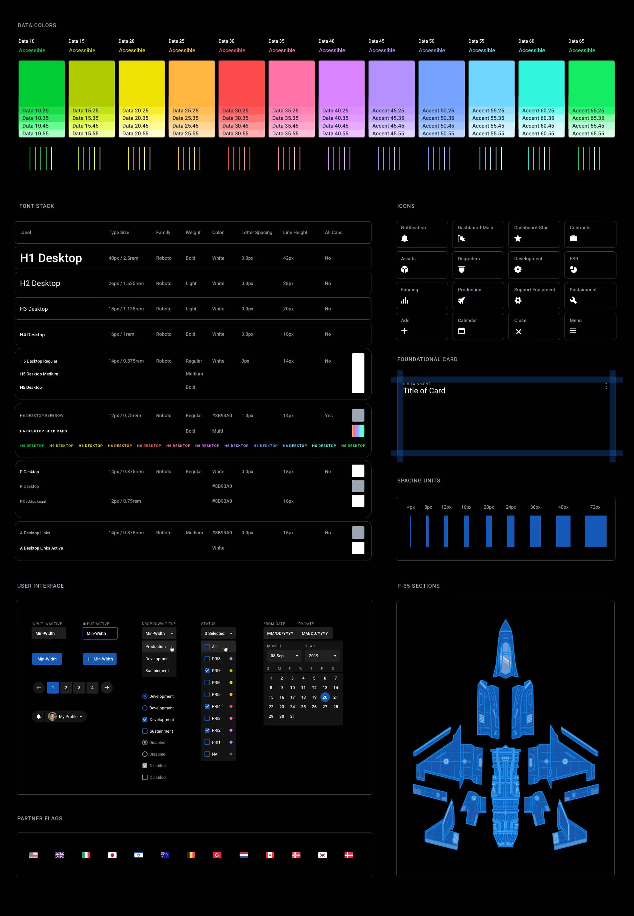
Auditing the existing Ui and creating the JPO Design System
Coming onto this work, I didn't know I would be doing an audit but after seeing how rough the spacing, type sizing, inconsistent inputs, and overall experience was, I decided to propose to the team to take on auditing the product as it was. I kept track of every piece of functionality and realigned each element to be sized, spaced, colored, and used consistently. This was challenging because we were still in the middle of delivering work in 2 week sprint cycles. We had to gradually shift over to using the new system elements which took time and teaching others.
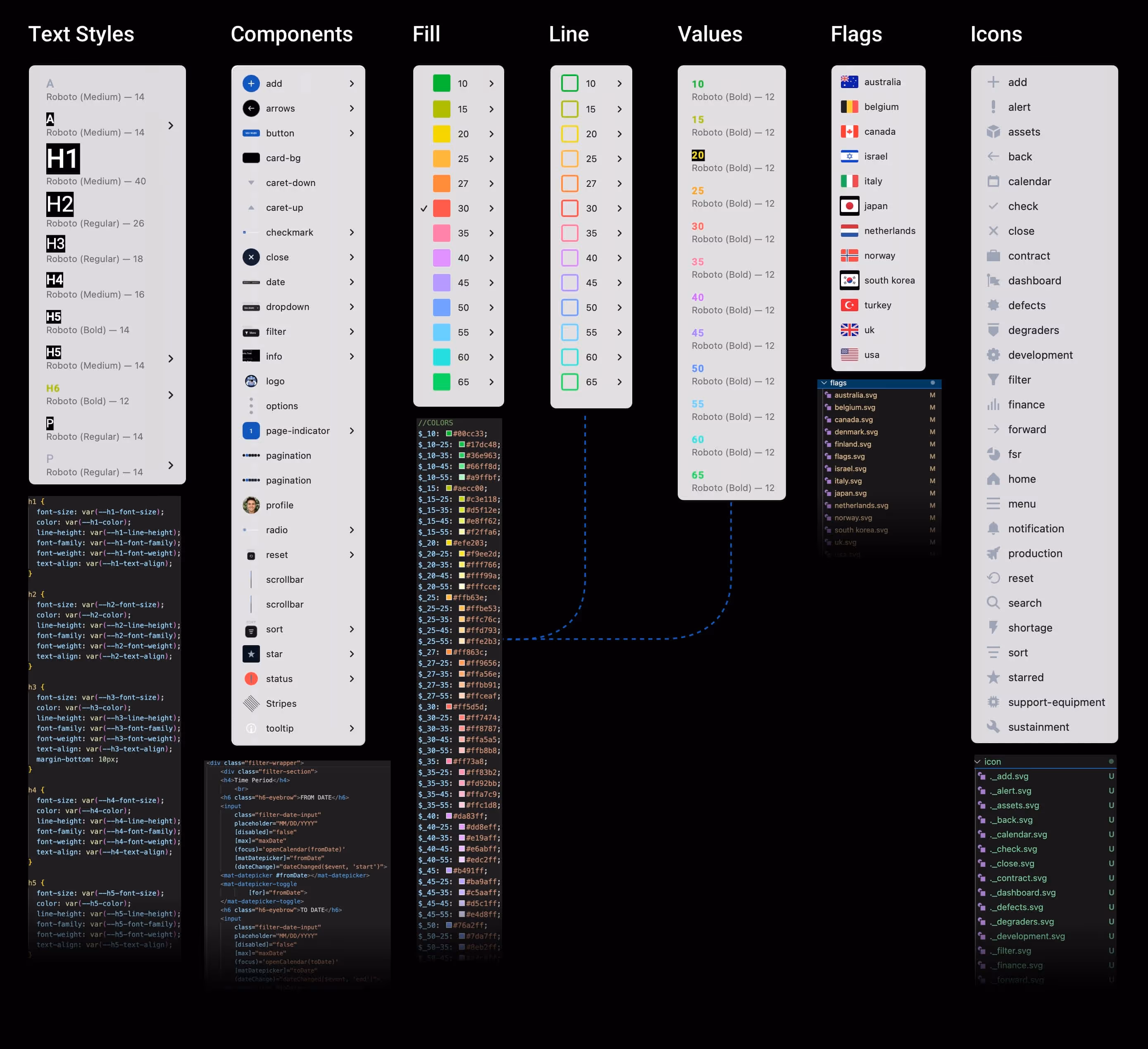
JPO Design System


90 Days in
Deploying the system across teams
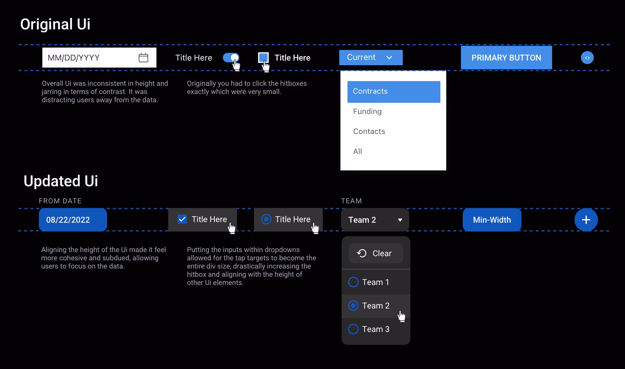
This core system was built to keep the experience consistent while also staying lean to allow for fast iterations for other designers. We were working on 2 week sprints and needed to balance System with Flexibility. Additionally, we were also early in our processes as a team and as a product, so knowing this, I didn't want to pigeon hole us in any hyper specific patterns just yet.
120 Days in
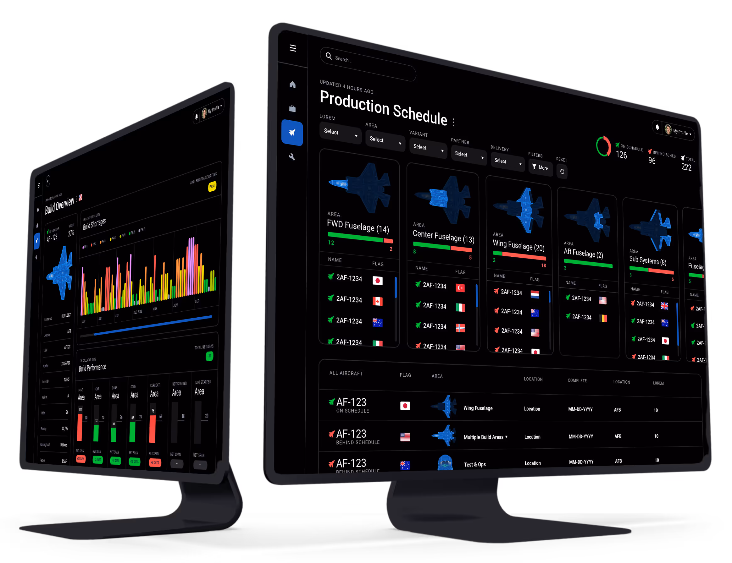
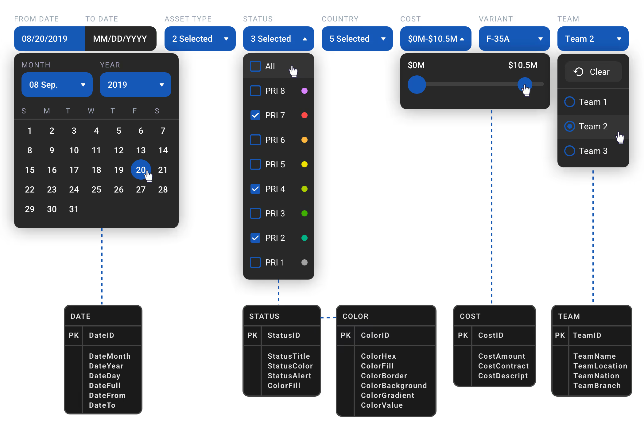
Dynamic Filter Bar powered by SQL databases
The core feature of this product and main way to interact with the data was by filtering. The component was built to scale across different data views while maintaining a consistent experience. What made this especially efficient was indexing queries behind the scenes so users could use the tool without lag. Aligning on each filter was quite the feat, as the convo usually circled around "and vs or", indexing, security, and overall feasibility.
150 Days in
Rapid design sprints for user needs with the new system
Since data was decentralized (due to security reasons) this made it virtually impossible to complete work on time, often leading to assumptive decision making and delays.
While the JPO has a good understanding of its key suppliers, there was often limited visibility down into the sub-tier suppliers that provide critical components supporting production.
Workers often didn't know what they would be doing when they showed up to work. This was mostly due to old and out-of-date information and decentralized decision making.
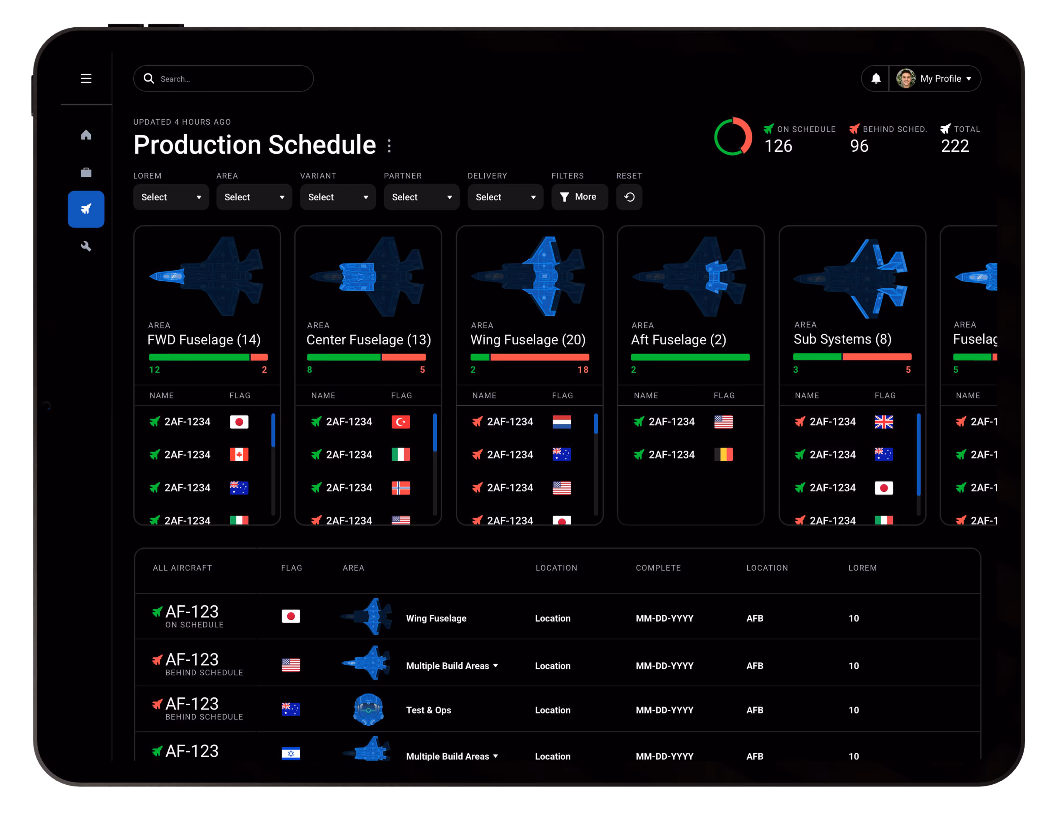
"As a Build Manager 🏗️, I need to see an overview of build areas and their performance so that I can maintain high levels of efficiency."
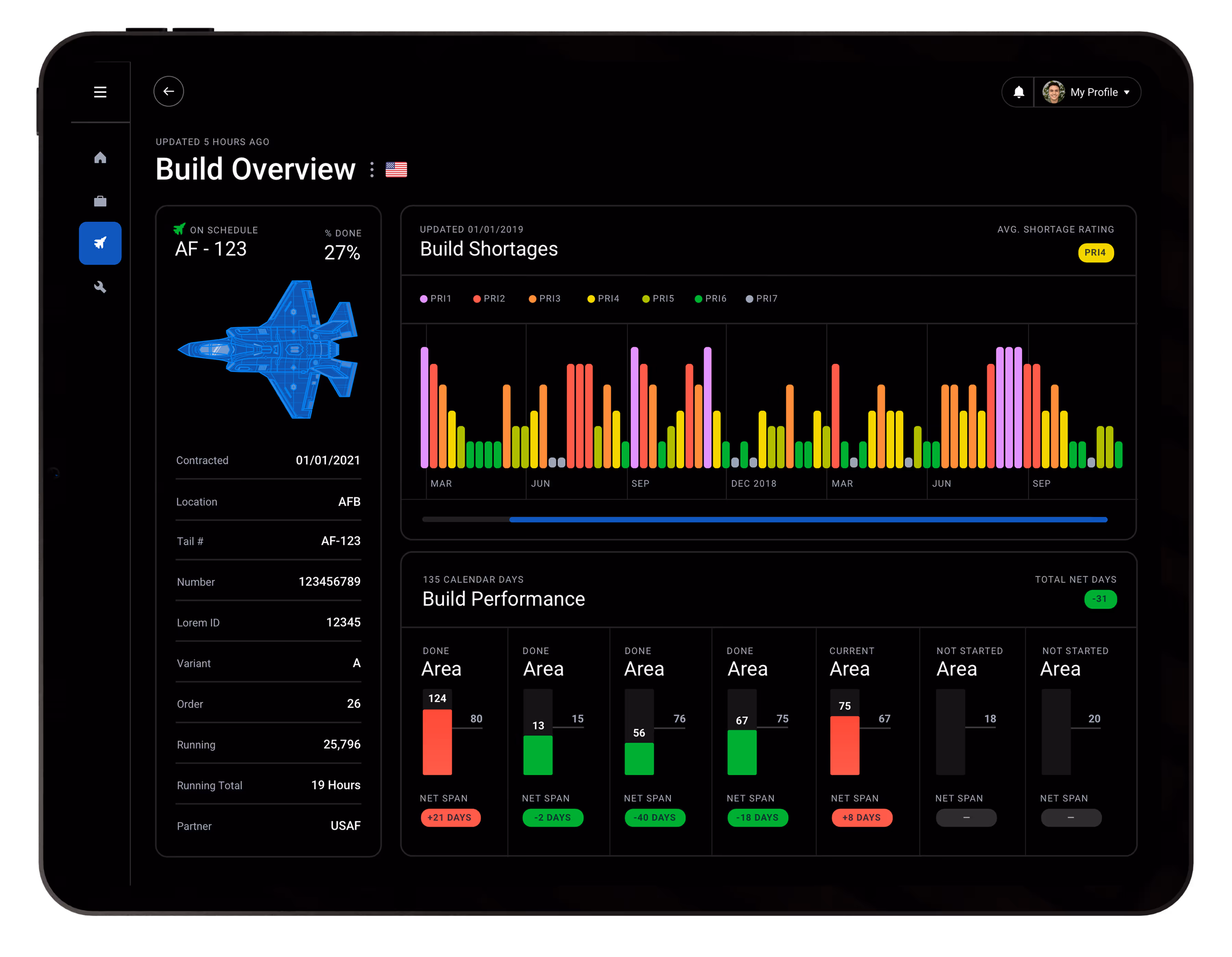
"As a Aircraft Manager ✈️, I need the ability to see aircraft details so that I can communicate with partners about their plane and keep them up to date on build status and expectations."
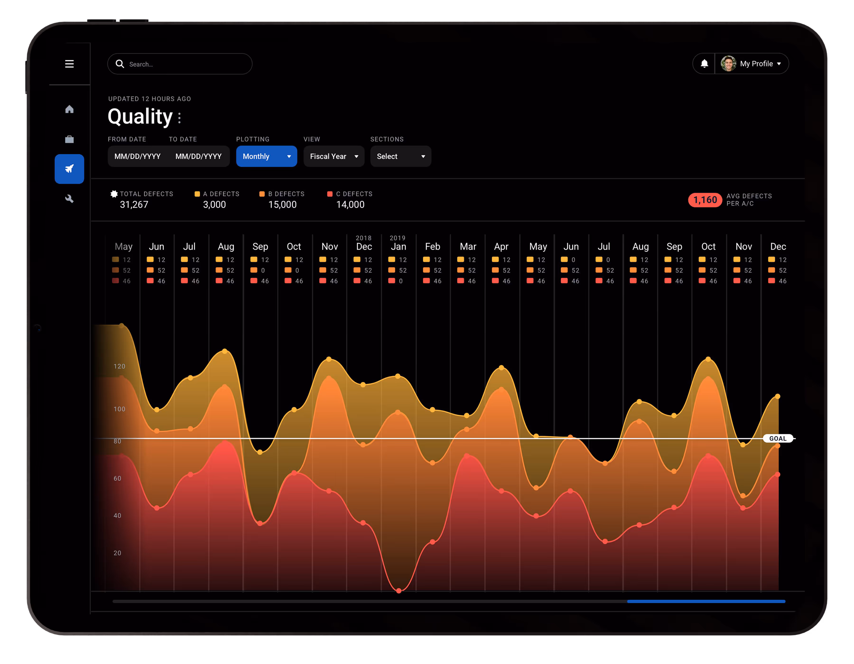
"As a Quality Manager 👷, I need the ability to track the recurring defects over time so that I can find replacement vendors."
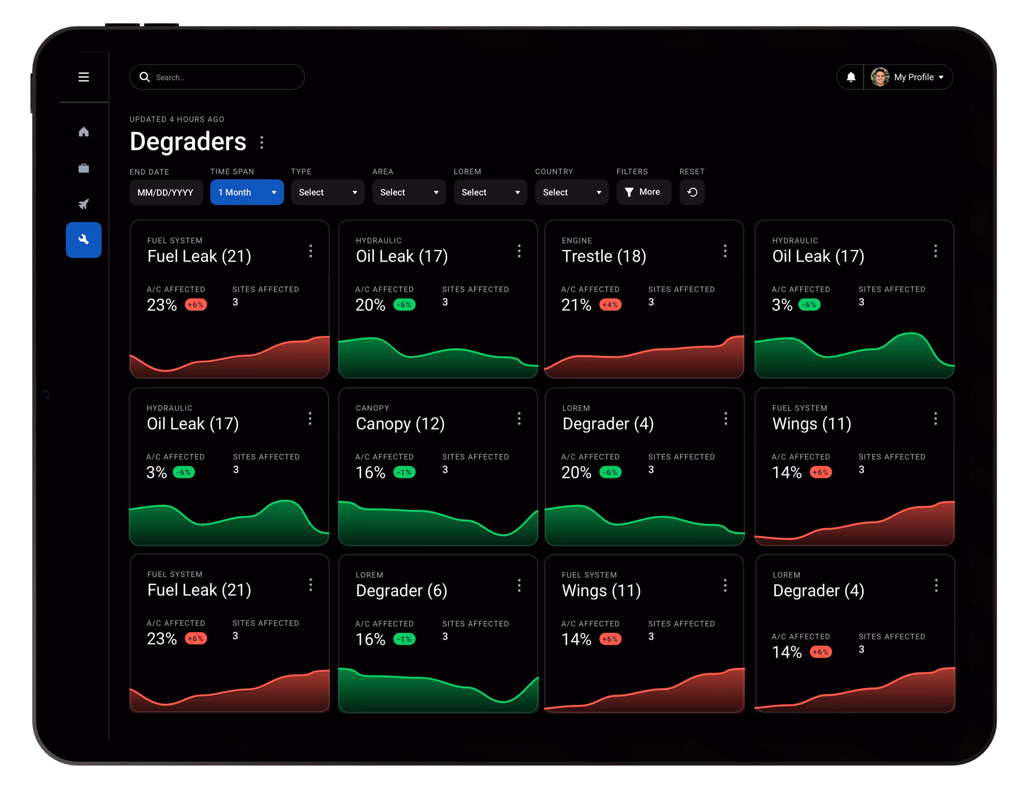
"As a Parts Manager ⚙️, I need to see the top trending degraders so that I can order new replacement parts and resolve major blockers."
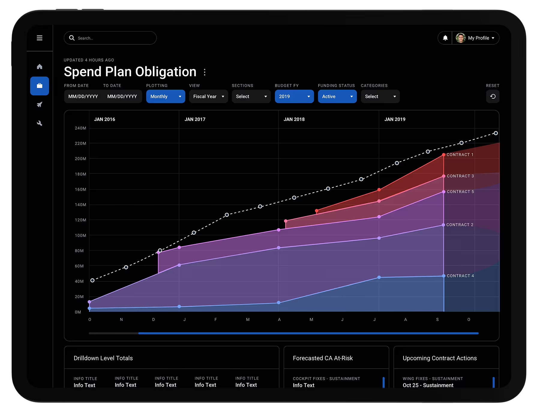
"As a Contract Officer 💸, I need to see total contract totals as it relates to the total obligation amount for the time period so that I can maximize our allotted obligated funding."
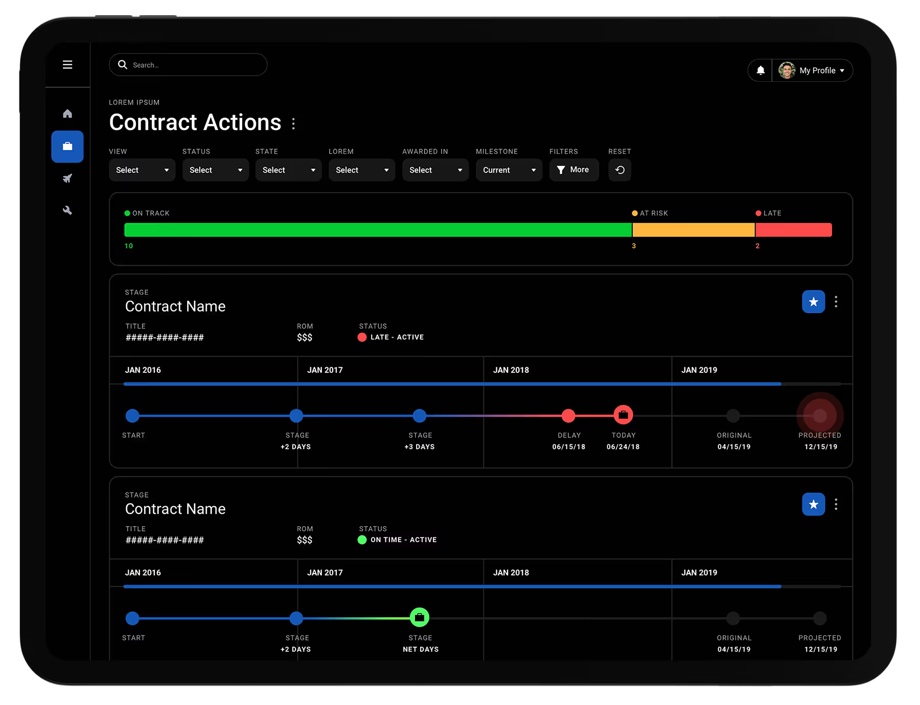
"As a Contract Specialist 📝, I need to bulk manage contracts and hit major milestones so that we don't submit them late and miss critical funding timelines."
.svg)
.svg)