Work
artifacts
about

Evolving Apple.com With a Product Mindset

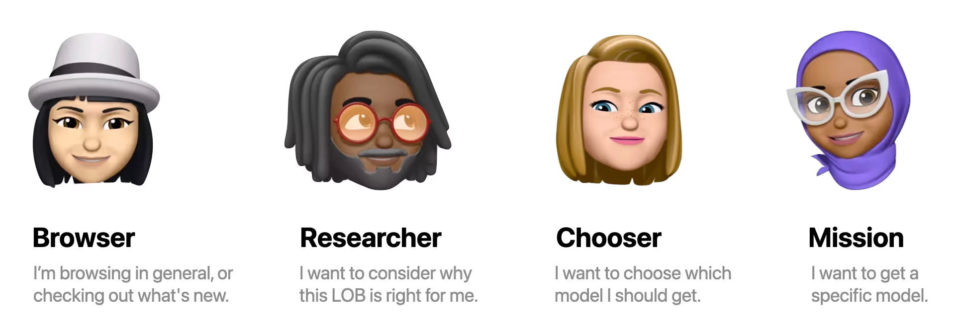
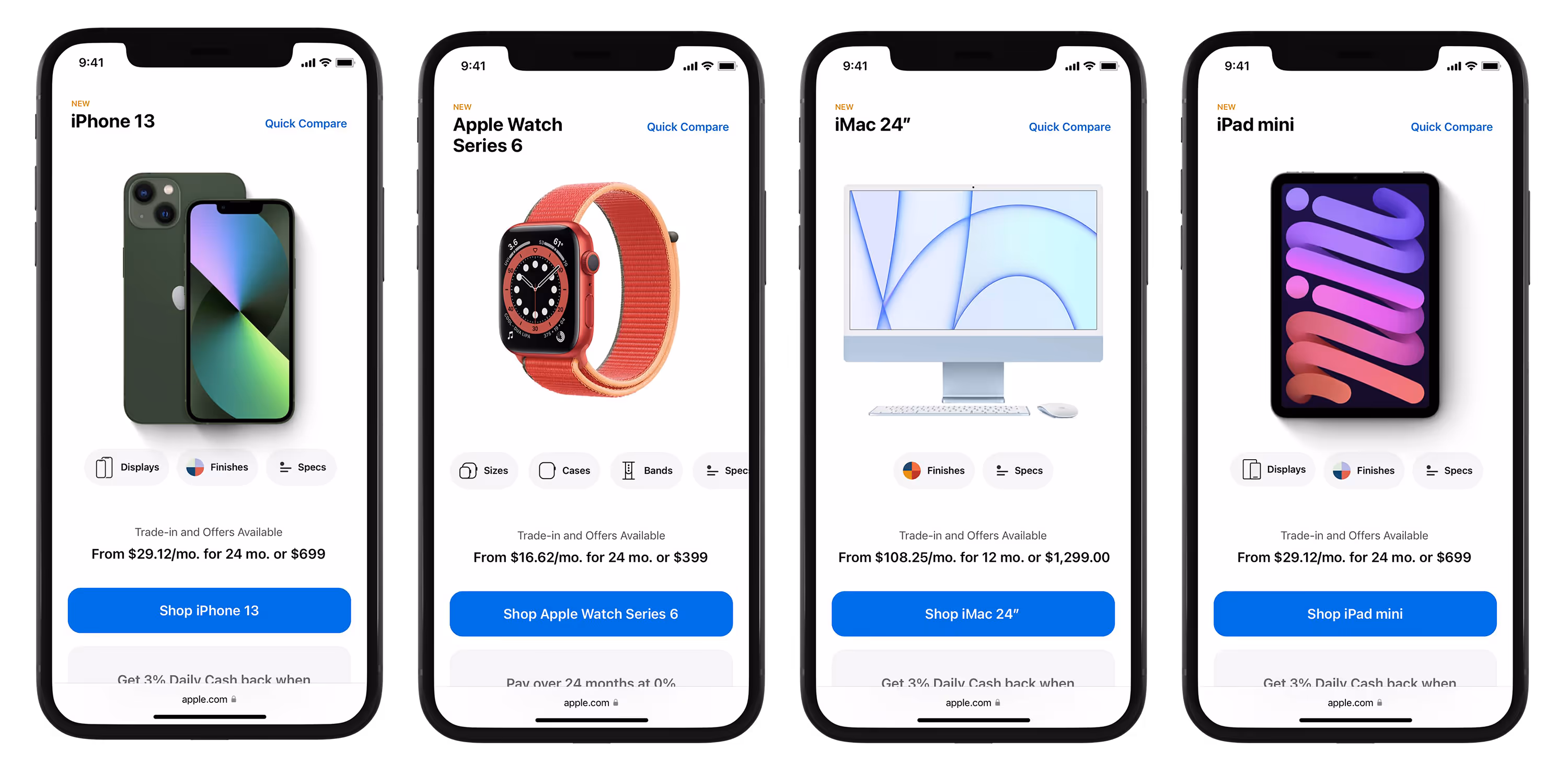
Building a educational framework to help underserved customers learn about products in beneficial ways; all in an effort to increase customer confidence towards conversion.
Company
Apple
Year
2020 - 2024
Role
Product Design

Understanding the customer  

Across all lines of business, we can see that the majority of traffic (at time of launch) are either Browser's, Researcher's, or Chooser's. These numbers only increase as time moves on into Evergreen times of the year. However, most of the year we design mostly for the Buyer type customer, overlooking a vast majority of our other customer segments.

Mac

Browser

43%

Researcher

24%

Chooser

5%

Buyer

28%

iPhone

Browser

32%

Researcher

14%

Chooser

7%

Buyer

46%

iPad

Browser

35%

Researcher

24%

Chooser

11%

Buyer

30%

Vision Pro

Browser

47%

Researcher

38%

Chooser

0%

Buyer

15%

Watch

Browser

41%

Researcher

29%

Chooser

12%

Buyer

18%

Airpods

Browser

19%

Researcher

16%

Chooser

28%

Buyer

37%

Apple TV

Browser

37%

Researcher

8%

Chooser

33%

Buyer

22%

Homepod

Browser

37%

Researcher

13%

Chooser

21%

Buyer

29%

"Apple can say Liquid Retina Display, but that does not mean anything to me. I will have to go somewhere else that can explain it better."

- Bessie T. -

"The commercials are awesome but when it comes to comparing products, I have the hardest time deciphering the differences."

- Henry S. -

Marketing jargon impacts conversion and causes friction. Especially when comparing across models.

liquid retina display
liquid retina xdr display
bionic chip
m4 pro chip
ray tracing
neural engine
private cloud compute
smart hdr
center stage
pro motion
truedepth
apple intelligence
spatial audio
unified memory
dynamic island
ceramic shield
spatial computing
60%

Of customer traffic would not scroll the entire Product Page.

50k+

Product pages were up to 50,000 pixels long at times.

Building a framework centered around the customer's needs

We built a framework to better educate our customers and help move them forward more confidently. Borrowing from how educational school systems work today (read: Bloom's Taxonomy); the taxonomy is a means to facilitating a transfer of knowledge from those more inclined to those yearning to understand a given topic. By leveraging this framing, we were able to create a new simplified framework called Product Education.

Structuring customer journey's guided by the framework

Following the direction of our framework, we used this to structure our pages and customer journeys. Meaning we considered them vertically AND horizontally across the site. We leveraged smart pathing to allow customers to skip ahead if they were further along in their journey. Data science was also able to validate our framework by noting that we had higher add-to-bag rates when customers would spend time learning and researching products before choosing a product to purchase.

Building atomically at the template and page level

Working at Apple is incredible and some things are already established in their design system like atoms and molecules. Teams wanted freedom to express themselves and their line of business. But this had negative consequences on the consumer by not having a consistent experience across Apple.com. Customers interact with multiple lines of business at Apple, not just one. Knowing this, immediately focused us on building out template and page level structures.

Templates built on function

Consistent experiences helped customers get familiar with our new design language and page structures; leading to less time searching for answers and more time focusing on learning. Each section on the page served a distinct function in the customer journey and was always built with scale in mind; constantly stress testing as we moved through the work.

Function derived from customer needs

Before designing anything in high fidelity, we always took a step back and designed with user needs blocks. These blocks kept us working objectively and forced conversations to focus on user needs and what needs to be within a viewport rather than how polished a screen needed to look. Both are valuable but early stage iterations needed to favor the former if we were going to build something actually useful.

Scaling function across contexts

When a design works well across different contexts, it shows the strength of the system behind it. Clean layouts, smart patterns, and clear decisions make complex experiences feel simple—and that simplicity is what makes them beautiful. The challenge however, has been convincing the rest of the studio to see beauty in the system the same way we do. It's taken years of meetings and conversations to get aligned and only recently have we launched templated pages. It's a journey I won't forget. But the story doesn't stop here.

Testing for customer confidence across mindsets

The goal was to see how usable the new page structures were, if they helped build confidence towards making a decision, and if they felt more helpful or easier to find the content they were looking for. This included interactive lineups, engaging guides, and treating pages more like utilities. In partnering with a third party research lab, we received strong feedback and a few things to work on but overall we had a solid foundation to move forward with.

Finding 01

The majority of respondents could recall info on the page and felt they got the info they needed.

Finding 02

New-to-device participants learned something new and actively visualized their life with the device.

Finding 03

Customer's were let down and wanted to test things and get hands on with the device and the features.

Improving customer confidence with interactive demos

Customers wanted to get hands on with products and test the new features, so the idea of virtual simulations (or demo's) came to fruition.

Definition
Enter demos.
What are they?

A demo facilitate's the understanding of a feature's benefit or value by means of simulating real-world usage. Knowing this, necessarily requires demo’s to be rich in nature due to their ‘real-world’ simulation approach.

Goals
What does
success look like?

1. Increase in page engagement.
2. Higher retention rate of knowledge.
3. Shorter time to purchase.
4. Create better educational content.
5. Shift our teams to a reusable mindset.

Internal Challenges
What's our
biggest hurdle?

Demo's required a new approach to how we think and create content. Traditionally, Apple builds multiple times and deploys once. We aimed to flip that and build a reusable system of demo's so we could build once and deploy multiple times.

Defining the demo system

Deploying confidence at scale

This new demo system could be containerized and deployed across channels and devices as the experience wasn't tied to scroll anymore. The ability to deploy to our website (both mobile and desktop), our in store app, third party apps, and partner apps offered our business teams new territory to operate in. It was also much more engaging for customers to interact with and for our data teams to collect insights on as we could much more easily track what was receiving engagement versus solely relying on dated scroll-based metrics.

The educational impact

18% increase to add to bag for engaged users.

53% increase to clicking on CTA's.

65% increase to comparing models and buy flow traffic.

Work
artifacts
about